
You might think there isn't much to setting up a shot. You might think it's all about making sure the content is there, and occasionally shooting your subject from a weird angle just because you can. But that's just not the case. Directors and Directors of Photography (Cinematographers) spend hours setting up shots just right so that they fulfill all the needs of a shot (the basic unit of a movie), they keep things interesting while maintaining a certain level of control so each shot fits together, they direct your eye to the important element(s) within the frame, and they enhance the scene by adding visual meaning. This is a lot of work, it takes a lot of planning and a lot of set up!
After reading this, I hope you can look at movies with a critical eye. Not only to be able to find meaning in what you see, but also to appreciate a quality image and understand some of the thought that went into creating it. Today we're going to look at the most basic elements of the DP's (Director of Photographer) tool chest. In other words, we'll be taking a look at compositional elements and how they affect the look and feel of an image as well as give it further meaning.
First you have think about a movie as a cohesive collection of work from 10s, 100s, or even 1000s of people. For each element to fit together, each worker must have control and maintain a consistency with the project as a whole. If any element starts jumping out at the viewer for it's crazy awesome style, then it takes away from the flow of the overall movie. Any style that's added must fit with the style of the project. And the project, at its most basic level, is simply a story. Everything must serve the story. If an image doesn't serve the story, it isn't right for the movie. If the visual style doesn't serve the story, it also isn't right for the movie. So the first job of any DP is to strip things down to the conventional and set up shots so that they can tell the story. The content rules, and the shot must be set up so as not to obscure or take anything away from the content. The primary job of the movie, and all of its tellers, after all, is communication of story.
In order to begin to communicate the story, the DP must use basic, conventional techniques so that the viewer can easily receive information. This works expressly because of the conventions. Audience members are used to seeing things presented this way, so they can therefore receive and quickly process the information each shot contains. If every shot breaks with convention the viewer will be hard pressed to understand the content of each and thus be unable to piece together the whole story. Some of these basic techniques are: to use the rule of thirds, shoot subjects at eye level, allow breathing room around subjects, keep each shot stable and balanced, ensure that shots are accurate, and direct the eye of the viewer.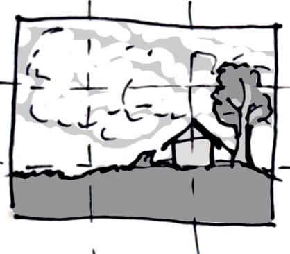 The rule of thirds is a general compositional convention followed by painters, photographers, and filmmakers alike. It's been in use for centuries. I can't say with any kind of certainty why it seems to make more effective and attractive images, but it does. Perhaps it has something to do with visual balance, who knows? But essentially the rule is that when setting up a shot, one ought to imagine that the image is divided into thirds both horizontally and vertically. You then end up with 9 smaller sections within each image (see image to the right). When you place your subject within the shot, or alternatively point your camera at the subject, you use the bisecting lines as a guideline for how to compose. Horizons, for instance, should not be place in the center, rather they should fall either on the 1/3 or 2/3 line so that, in the case of a landscape, 1/3 or 2/3 of the image will be filled with land and the rest with sky. Similarly, people in portraits should be placed along these bisecting lines, so that their eyes fall approximately 2/3 up from the bottom. If their heads are in the center, not only will the image feel awkwardly composed, but a lot of wasted space will be sitting over their heads. I can't count the number of times I have received snapshots from family and friends that have everyone's heads in the center of the image so that we get an image full of ceiling. Now, if there is something interesting or important about the ceiling and it therefore requires inclusion in the image, by all means, include it. But if the people are the only focus of the image, they should fill a majority of the frame. If you look again at my little illustration of the rule of thirds, you can see that I placed the horizon line one third up from the bottom, I also placed the small house (a point of interest and importance) at bisecting lines and I placed a large, interesting cloud on another pair of bisecting lines.
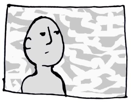 Another reason for putting people's eyes approximately 2/3 from the bottom of the image is so that they appear to the viewer to be at eye level. Another way of achieving an eye-level look is to have the camera recording the subject straight on. If you have the camera higher or lower than the subject, eye-level is lost. The effect of having the subject at eye level is to put the subject on equal footing with the viewer. The audience can more easily identify with this person if he/she doesn't appear to be above or below us. If you check out my illustration of this little dude, you'll see I used the rule of thirds and "shot" him straight on to give the eye-level effect. In addition to that, I left a little breathing room around him and I left more space on the side where he is looking, so as not to give the viewer the sense of being closed in.
 In addition to the techniques mentioned above, the DP wants to make sure that the camera is stable and not tilted to an angle so as to maintain the comfort of the viewer. If the camera shakes, or is tilted at an angle (see right), the viewer may feel anxious or unsettled. This can be worked for effect if desired, but for a basic shot, the DP wants stability. You might think it is more interesting to tilt the world to an angle, but this isn't how we view everyday life, so it makes for discomfort to force the viewer to look at an off-kilter image, especially if the viewer then has to see and understand movement in that image.
There are other ways that a DP can ensure that shots effectively transmit appropriate information. In addition to employing the above mentioned techniques, the DP has a responsibility to also make sure that each image is an accurate description of the subject and that the appropriate information is conveyed. Let's say that the DP wants to show us a cube. He could shoot it from straight on and show only one of its sides. Content is presented, but it's unclear. The viewer may think she is seeing a flat square. It would be more effective to show multiple sides of the cube to not only give the image better depth, but to give the viewer a more accurate impression of the cube. 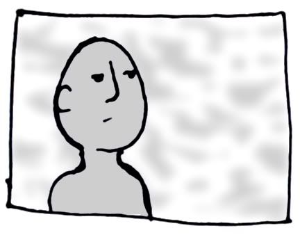 The DP also directs the eye of the viewer to make sure that the viewer knows exactly where to look and efficiently receive information. This can be done in a number of ways. A close up can be used to focus attention on something. Or an extreme shallow focus can be used so that the item is in focus but nothing else is. Check out my little dude to the left again. With the background thrown out of focus, we are able to completely focus on him. Lighting can also
 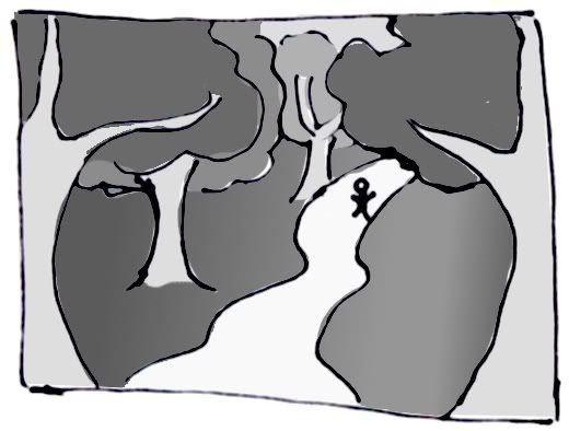 be used (the most obvious example would be a spotlight, but there are of course more subtle ways of doing this), and the inclusion of lines within an image can lead the viewer's eye to the area of focus. See the image to the right. The perspective of the trees and the diagonal lines of the path lead the eye directly to the person in the shot.
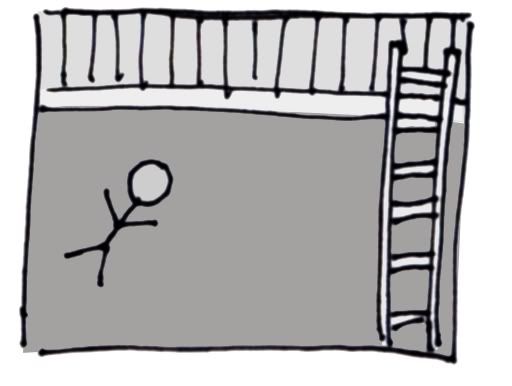 Beyond providing direct access to basic content, the DP (and director) also needs to keep a little visual interest going so his audience doesn't get bored. This is generally done for the sake of beautiful imagery and style, though other effects may be achieved secondarily. Some ways that a DP can give visual interest
 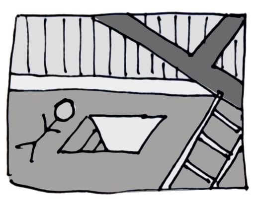 are: creating unusual compositions, varying shots (close ups with wide shots), and playing with the shapes and lines of items in view before him. Diagonals seem to the most exciting and dynamic of lines.
 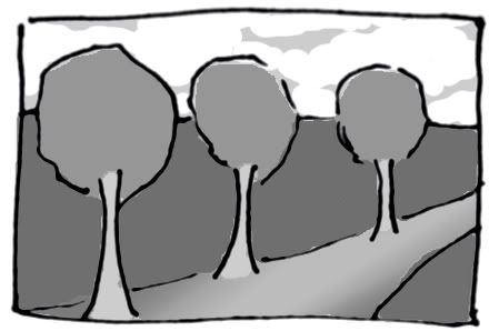 Many scenes can be hugely enhanced by the inclusion of diagonals. Let's say you have a body on a floor in a room with a ladder (see above left). Not very interesting. But let's say that we add some diagonals and depth (right). Depth is added by putting a beam and ladder in the foreground, and even further depth is added with the trapdoor leading down. An example of shapes would be the circular shape of trees. If you look at the image to the right of three trees, the image includes very round trees as well as various diagonals (in the perspective lines of the trees and the path).
Beyond communication of story and visual interest, the director and DP are also concerned with enhancing meaning by any means available to them. With respect to composition, this means such things as the use of space, relative size of items within the frame (and other methods of visual hierarchy), as well as angles and shots (which will be discussed further in later posts). If a person is placed in a frame with an emptiness around him, or a large space between him and another person, this may suggest that he is lonely or distant. Also, the director may choose to show us an image of a woman walking up to a house with an enormous door (as in The Stepford Wives) to emphasize her feeling of being overwhelmed by her environment or enemies. Look again at the tiny person on the path in the woods (above). The trees fill the frame and the person by comparison seems insignificant and outweighed by his surroundings. You may think this is 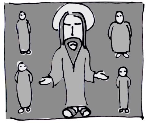 incidental, but shots like this are quite intentional. If I didn't want my little person here to be overwhelmed and feeling tiny in the scary woods, I might instead place the camera closer to the subject, shoot straight on (eye level), and have the trees in the background. Relative size and other methods of visual hierarchy have been employed in art since its beginnings.
  In medieval art, it was common for the artist to make more important figures larger, place them higher in the image, place them centrally, and otherwise show them to have greater importance (see above left). Later, when perspective began to be used, there were even more ways of showing visual hierarchy. Check out "The Last Supper" (right). Jesus is placed centrally and all of the lines of perspective in the room lead to him. These techniques are used in film all the time to tell the viewer who is bigger, stronger, or, conversely, who is completely overwhelmed and insignificant.
There are certain things that DPs/directors do with composition that just make pros and semi pros quiver with excitement. They may create crazy, unusual compositions that you never would have thought to create, they may show multiple scenes or camera angles at once by incorporating mirrors (or open doorways/windows) in a shot, and they may use focus creatively. A DP may give us extremely shallow focus, and throw most of the image out of focus, she may give us extremely deep focus and have things very close and very far from the camera equally in focus (very difficult to achieve), and she may shift the focus during the shot ("rack focus") from one precise point to another. These in addition to all the elements discussed above are some things to start looking for as you watch movies in the future and specifically as you watch Citizen Kane this weekend.
You may be tempted to fall full-force into composition watching like many of us do with this movie. Orson Welles and DP Gregg Toland created arguably some of the best images of all time, so you wouldn't be alone if you became caught up in them. In particular you should be looking for use of space, relative size, and deep focus. But don't forget to enjoy the story as well. Many forget to talk about it, but Citizen Kane has one of the most wonderfully constructed stories of any film. And this story is the real reason it should be on everyone's top 100 list. At its heart, it is the mystery of a man's life. And we have the opportunity, while watching the mystery unravel, to both completely fall in love and in hate with the man at the center of the tale. He is a man of extremes, of massive wealth and corruption as well as meager beginnings and a touching, compassionate heart. I hope you love it!
I will open a discussion on Monday about Citizen Kane and if you watch it before then, please participate in the discussion. I'd love to hear how the movie affected you, and if you were able to make out any meaning for yourself by looking at the composition. If you watch the movie later and still want to go back to the post and participate, that is ok too. Or if you want to discuss the compositional elements of another film, that also works. Mostly I'm just hopeful that this will be interactive and we can get some lively discussions going.
Back to the full blog...
Wednesday, November 01, 2006
Understanding Movie Visuals -- Composition
Subscribe to:
Post Comments (Atom)
2 comments:
Great Blog.
Thank you so much for the information!
Hi. This is really interesting. Do you have any book recommendations if I'm interested in reading more into the topics discussed here?
Post a Comment